
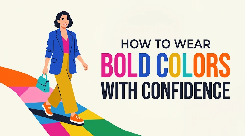
For many, stepping into a room wearing electric cobalt, vibrant saffron, or head-to-toe crimson feels less like putting on an outfit and more like making a high-stakes declaration. Neutral palettes—beige, navy, charcoal, black—offer a comfortable, low-risk sanctuary. They hide stain risks, blend into crowd backgrounds, and demand minimal analytical thought during morning routines.
Yet, relying exclusively on safe hues carries an unexpected cost. It stifles personal expression, signals a preference for blending in over standing out, and ignores the profound psychological benefits of color. Color psychology consistently demonstrates that vivid hues elevate mood, project authority, and create memorable visual identity.
Wearing bold colors successfully is not an innate talent bestowed at birth; it is a mechanical skill governed by basic design principles, visual proportion, and strategic styling.
This comprehensive guide breaks down the transition from neutral safety to confident color mastery. You will learn how color theory works on the body, how to scale intensity progressively, how to balance high-contrast outfits, and how to avoid the common styling mistakes that turn dynamic looks into chaotic noise.
1. Decoding Color Psychology and Finding Your Primary Palette
Before reaching for bright garments, you must understand how colors interact with light, your skin tone, and visual perception. Bold style is built on deliberate choices rather than random impulse.
       [ HIGH CONTRAST ]
     (Bright + Deep Anchor)
              |
  +-----------+-----------+
  |                       |
[MONOCHROMATIC]     [ANALOGOUS]
(Tonal Gradients)  (Neighboring Hues)
  |                       |
  +-----------+-----------+
              |
       [ LOW CONTRAST ]
     (Subdued + Soft Accent)
Understanding Color Undertones
Every skin tone possesses surface tones (fair, medium, deep) and underlying warmth or coolness (undertones). Matching the temperature of your bold clothing to your natural undertone prevents garments from overpowering your face.
-
Cool Undertones: Characterized by bluish veins, a tendency to burn easily under sun exposure, and silver jewelry preference. Colors that shine here include cobalt blue, emerald green, magenta, and true violet.
-
Warm Undertones: Characterized by greenish veins, easy tanning, and gold jewelry preference. Standard matches include mustard yellow, burnt orange, terracotta, warm coral, and olive-tinged brights.
-
Neutral Undertones: A balance of cool and warm elements, allowing for flexibility across both cool and warm color spectrums.
Key Takeaway: If a bright color makes your complexion look washed out, tired, or yellowed, the garment’s temperature clashes with your undertone. Shift the temperature while keeping the intensity—trade warm tomato red for cool cherry red.
Color Theory Frameworks for Outfits
To blend bold colors without visual conflict, apply established visual design frameworks:
+------------------+------------------------------------------------+--------------------------------------+
| Color Strategy   | Definition                                     | Practical Application                |
+------------------+------------------------------------------------+--------------------------------------+
| Monochromatic    | Varying shades, tints, and tones of 1 hue      | Electric blue suit with powder blue  |
| Analogous        | Using colors adjacent on the color wheel       | Tangerine top with fuchsia trousers  |
| Complementary    | Using colors opposite each other on the wheel  | Royal blue jacket with orange clutch |
| Triadic          | Using 3 evenly spaced colors on the wheel      | Mustard yellow, cyan, and magenta    |
+------------------+------------------------------------------------+--------------------------------------+
Example in Practice:
-
Novice approach: Pairing a neon lime sweater directly with purple pants without balancing elements creates harsh visual division.
-
Strategic approach: Pairing an emerald green knit sweater with navy trousers and olive suede boots creates an analogous scheme anchored by dark neutrals.
2. The Ladder of Intensity: A 4-Step Progressive Framework
Transitioning overnight from muted charcoal to head-to-toe canary yellow usually induces self-consciousness. To build genuine confidence, use this 4-step progressive framework:
[Level 1: The Pop] ---> [Level 2: The Anchor] ---> [Level 3: The Block] ---> [Level 4: The Mono]
  (Accessories)            (Single Garment)          (Complementary)          (Head-to-Toe)
Level 1: The Accent Pop
Introduce high-vibrancy hues through low-real-estate accessories. This keeps bold colors away from your face while training your eye to accept higher saturation levels.
-
Target Items: Socks, pocket squares, leather belts, handbag straps, shoes, silk scarves, or watch bands.
-
Base Outfit: Monochrome or neutral baseline (e.g., charcoal suit, white button-down, raw denim).
-
Action: Add one single high-chroma element. An all-navy outfit paired with bright red suede sneakers or a saffron yellow handbag immediately gains energy without feeling overwhelming.
Level 2: The Anchored Garment
Select one primary structural piece of clothing to feature a bold color, keeping every other element completely neutral.
-
Target Items: A tailored blazer, a heavy knit sweater, wide-leg trousers, or a structured mid-length skirt.
-
Base Outfit: Ground the rest of the ensemble in black, navy, camel, gray, or crisp white.
-
Pro Tip: Place the bold garment on the half of your body you feel most comfortable highlighting. If you prefer keeping attention on your upper body, opt for a cobalt blazer with dark wash denim.
Level 3: Strategic Color Blocking
Pair two distinct bold colors together by utilizing structured silhouettes and clean color boundaries.
-
Rule of Engagement: Avoid busy prints or detailed textures when combining two strong colors. The strength comes from solid planes of color meeting directly.
-
Classic Combinations:
-
Fuchsia + Tangerine (High-energy, warm summer pairing)
-
Royal Blue + Canary Yellow (High-contrast, classic sporting pairing)
-
Forest Green + Burnt Orange (Warm, autumn-inspired contrast)
-
Level 4: The Monochromatic Power Move
Dressing in a single bold color from shoulder to hem requires precise attention to texture and fit.
-
Execution Strategy: Avoid matching exact dye lots unless wearing a tailored suit. Instead, build a tonal gradient using different shades and textures of the same color family.
-
Example: Combine a burgundy leather jacket, a wine-colored silk blouse, and deep plum wool trousers. The varying light reflections break up the silhouette cleanly.
3. Structural Rules: Fabric, Fit, and Texture
Color does not exist in isolation; it interacts directly with fabric weave, light reflection, and silhouette structure. High-saturation shades magnify garment details, making precise construction essential.
Texture Dampening vs. Amplification
-
Matte Fabrics (Texture Dampening): Materials like wool, matte silk, cotton twill, cashmere, and suede absorb light. They tone down bright pigments, making intense colors appear deeper, richer, and easier to wear.
-
Lustrous Fabrics (Texture Amplification): Materials like satin, patent leather, vinyl, sequins, and silk taffeta reflect light sharply. High-contrast colors executed in shiny fabrics dramatically increase visual volume and impact.
Pro Tip: When experimenting with a difficult or ultra-bright color like electric orange or lime green for the first time, choose matte fabrics like cashmere or washed linen rather than shiny satin or synthetic knits.
       MATTE FABRICS                      GLOSSY FABRICS
(Absorbs Light / Softens Impact)     (Reflects Light / Amplifies Impact)
 ┌─────────────────────────────┐      ┌─────────────────────────────┐
 │ Cashmere • Suede • Wool     │      │ Satin • Patent • Silk       │
 │ Cotton Twill • Matte Linen  │      │ Sequins • Vinyl • Taffeta   │
 └─────────────────────────────┘      └─────────────────────────────┘
               ▲                                    ▲
               │                                    │
   [Best for First-Time Wearers]        [Best for High-Impact Statements]
Tailoring and Fit Discipline
Bold colors draw visual focus instantly to seamlines, fit issues, and fabric tension.
-
Avoid Excess Pulling: Tight horizontal pulling across buttons or seams is much more visible on yellow, red, or white garments than on black garments.
-
Embrace Clean Lines: Pair bright colors with simple, minimal cuts—such as straight-leg pants, A-line skirts, tailored coats, and crew-neck sweaters. Avoid excessive ruffles, zippers, or extraneous details that visually clutter an already intense piece.
4. Grounding Techniques: The Art of Neutral Anchors
Wearing bold colors naturally is largely a matter of framing. Neutral anchors provide visual rests for the eye, structuring bright elements into a coherent whole.
+-------------------+--------------------+---------------------------------------+
| Neutral Base      | Pairing Strategy   | Ideal Bold Partners                   |
+-------------------+--------------------+---------------------------------------+
| Deep Navy         | Lowers harshness   | Crimson, Saffron, Lime, Coral         |
| Crisp White       | Maximizes contrast | Azure Blue, Emerald, Fuchsia, Tangerine|
| Warm Camel/Tan    | Softens intensity  | Violet, Cobalt, Olive, Scarlet        |
| Charcoal / Gray   | Provides balance   | Canary Yellow, Magenta, Bright Cyan   |
+-------------------+--------------------+---------------------------------------+
The 60-30-10 Rule in Fashion
Borrowed from interior design, this classic ratio creates balanced, professional outfits:
-
60% Primary Foundation: Your neutral base (e.g., a dark navy trench coat and trousers).
-
30% Secondary Accent: Your core bold garment (e.g., an emerald green silk shirt).
-
10% Focal Pop: A small, high-contrast detail (e.g., a mustard gold silk scarf or pocket square).
   +-------------------------------------------------------+
   |                       60%                             |
   |              NEUTRAL FOUNDATION                       |
   |           (Navy Blazer & Trousers)                    |
   +------------------------------------+------------------+
   |                30%                 |       10%        |
   |          SECONDARY BOLD            |    FOCAL POP     |
   |       (Emerald Silk Shirt)         | (Gold Scarf/Acc) |
   +------------------------------------+------------------+
5. Common Pitfalls to Avoid
Even seasoned dressers can miscalculate when working with saturated colors. Below are three critical mistakes and how to fix them.
                                 COMMON PITFALLS
                                        │
        ┌───────────────────────────────┼───────────────────────────────┐
        ▼                               ▼                               ▼
 [ The Candy Shop ]           [ Over-Accessorizing ]         [ Ignoring Makeup & Hair ]
 Multi-neon overload           Matching everything            Dueling focal points
        │                               │                               │
        ▼                               ▼                               ▼
   (CORRECTION)                    (CORRECTION)                    (CORRECTION)
 Ground with dark neutrals       Vary textures & tones           Keep makeup clean & simple
Pitfall 1: “The Candy Shop Effect”
-
The Mistake: Combining multiple high-saturation neon shades with zero neutral grounding elements.
-
The Result: The eye moves erratically across the outfit without a clear focal point, making the look feel chaotic.
-
The Fix: Limit your high-saturation pieces to a maximum of two per outfit, and anchor them with dark, matte neutrals like navy, charcoal, or dark olive.
Pitfall 2: Over-Accessorizing in Matchy-Matchy Hues
-
The Mistake: Wearing an electric blue dress, electric blue shoes, an electric blue bag, and electric blue earrings in identical shades.
-
The Result: The outfit appears flat, manufactured, and overly rigid.
-
The Fix: Introduce slight tonal variations or use neutral accessories to frame the bold dress cleanly.
Pitfall 3: Ignoring Hair and Makeup Contrast
-
The Mistake: Pairing high-intensity clothing with complex, high-contrast makeup (e.g., neon eyeshadow combined with bright lipstick and a bright orange dress).
-
The Result: Facial features get lost as competing elements fight for attention.
-
The Fix: When wearing high-impact clothing, keep your makeup fresh, balanced, and polished. Allow the clothing to remain the primary statement.
6. Real-World Styling Scenarios
Applying color concepts effectively depends on your setting. Here is how to adjust saturation across three common real-world environments:
Scenario A: The Professional Office
You want to project authority and vitality without breaking corporate dress codes.
-
Outfit Blueprint: A tailored navy pantsuit paired with a silk crew-neck top in vibrant coral or cobalt blue. Finish with neutral black leather pumps and minimal gold jewelry.
-
Why It Works: The deep navy suit acts as a clean frame, keeping the overall silhouette grounded and professional, while the silk blouse adds personality.
Scenario B: Casual Weekend Outings
You want an effortless, relaxed look that still feels intentional and stylish.
-
Outfit Blueprint: Straight-leg mid-wash blue denim paired with a chunky, cable-knit sweater in bright saffron yellow or apple green. Finish with crisp white canvas sneakers and a tan cross-body bag.
-
Why It Works: The texture of the chunky knit dampens the color’s intensity, while classic denim and white sneakers keep the outfit casual.
Scenario C: Evening Social Events
You want to stand out at an evening dinner, gallery opening, or celebration.
-
Outfit Blueprint: Wide-leg trousers in rich fuchsia paired with an oversized blazer in deep plum, grounded by a fine-knit black camisole underneath.
-
Why It Works: This monochromatic-adjacent palette mixes deep, rich jewel tones with a bright focal pop, delivering high visual drama without feeling visually noisy.
7. Frequently Asked Questions (FAQ)
Can I wear bold colors if I have a very pale or very deep skin tone?
Yes. Tone and contrast matter much more than your absolute skin depth. Pale complexions often look great in clear jewel tones like sapphire blue, ruby red, and emerald green, which create striking, elegant contrast. Deep complexions naturally handle ultra-vivid hues like neon yellow, bright orange, white, and hot pink exceptionally well without getting washed out.
How do I make bold colors look expensive rather than cheap?
Focus on three factors: fabric quality, garment structure, and maintenance. Cheap synthetic fabrics in bright colors tend to reflect light harshly and show wear quickly. Opt for natural materials like wool, silk, linen, and heavy cotton. Ensure the item is tailored neatly and well-pressed—wrinkles, pills, and loose threads stand out far more on bright clothes than on black ones.
What is the easiest bold color to start with if I only wear black?
Cobalt blue or rich burgundy are the easiest entry points. Cobalt blue sits comfortably close to classic navy, making it easy to pair with black, gray, and denim. Burgundy functions almost like a neutral, adding depth and warmth without demanding extreme visual contrast.
How do I wash bright clothing to prevent fading?
Always turn garments inside out before washing, use cold water settings, and select a gentle detergent formulated for colors. Avoid heat drying when possible, as high temperatures degrade fabric fibers and fade pigments; line-drying or laying items flat in the shade keeps colors vibrant over time.
8. Final Action Plan: Building Your Color Confidence
Confidence in personal style is built through practice, experimentation, and small adjustments over time. You do not need to rewrite your entire wardrobe overnight to enjoy bright colors.
       Step 1: AUDIT
     Identify undertone &
    select ONE target color
              │
              ▼
       Step 2: START SMALL
    Add 1 accessory or accent
     to your standard outfit
              │
              ▼
       Step 3: ANCHOR
     Incorporate 1 main piece
      framed by neutral bases
              │
              ▼
       Step 4: EXPAND
    Experiment with color blocks
      and rich tonal layers
Your 4-Week Action Blueprint
-
Week 1 (Audit): Determine your skin’s undertone (cool, warm, or neutral). Select one high-saturation color that brings out your natural complexion.
-
Week 2 (The Pop): Wear your favorite neutral outfit, but integrate a single bright accessory—a bold scarf, sock, shoe, or handbag. Pay attention to how comfortable you feel throughout the day.
-
Week 3 (The Anchor): Replace a neutral top or bottom with your target bold color. Frame it entirely using your reliable neutral pieces (navy, black, camel, or white).
-
Week 4 (The Block): Experiment with combining two complementary or analogous shades, using structured silhouettes and matte textures to keep the look balanced.
Fashion is fundamentally a creative tool meant to serve you, enhance your everyday experience, and reflect your personal identity. By stepping past safe neutrals and using color theory thoughtfully, you gain control over your visual impression. Pick your target hue, anchor it with intention, and wear it with confidence.
